Designing a website requires a clear strategy, structured planning, and user-focused execution. Understanding your audience, defining goals, and creating a logical site structure ensure every element serves a purpose. From wireframes to high-fidelity mockups, responsive layouts, accessibility compliance, and performance optimization, each step impacts usability and engagement.
This guide breaks down how to design a website step by step, covering research, planning, design tools, development, testing, and launch strategies, so you can build a website that attracts visitors, drives actions, and delivers a seamless user experience.
How to Design a Website: Step-by-Step Guide
You can design a website from start to finish without external help. This guide walks you through every action step you need to take. The process covers research, planning, visual design, technical setup, and optimization. You will learn exactly what to do at each stage.
Follow these steps to design a website successfully.
Step 1: Define Your Website Goals and Target Audience
Begin every website design project by identifying specific goals and understanding who will use your site. This foundation determines every design decision you make.
Start with concrete objectives.
- Are you building an e-commerce store to generate sales?
- A portfolio to attract clients?
- A blog to share expertise?
Your goals shape everything from layout choices to call-to-action placement.

Next, research your target audience thoroughly. Create detailed user personas that include demographics, pain points, browsing habits, and device preferences. Interview potential users if possible. Survey existing customers to understand their needs. Analyze competitor websites to see what works in your industry.
Document specific user tasks your website must support. If you run a service business, users need to easily find contact information, review services, and request quotes. An online store requires intuitive product browsing, filtering, and checkout processes.
Professional designers conduct stakeholder interviews and competitive analysis before touching any design tools. This research prevents costly redesigns later. At six2eight, we start every project with discovery sessions that align business goals with user needs, ensuring your site serves both audiences effectively.
Step 2: Plan Your Information Architecture and Sitemap
Information architecture determines how content is organized across your website. A clear structure helps visitors find information quickly and improves search engine crawling.
Create a sitemap that maps every page and shows relationships between them.
Start with main navigation categories, then break down subcategories and individual pages. Most business websites need these core pages:
- Home
- About
- Services or Products
- Blog
- And Contact
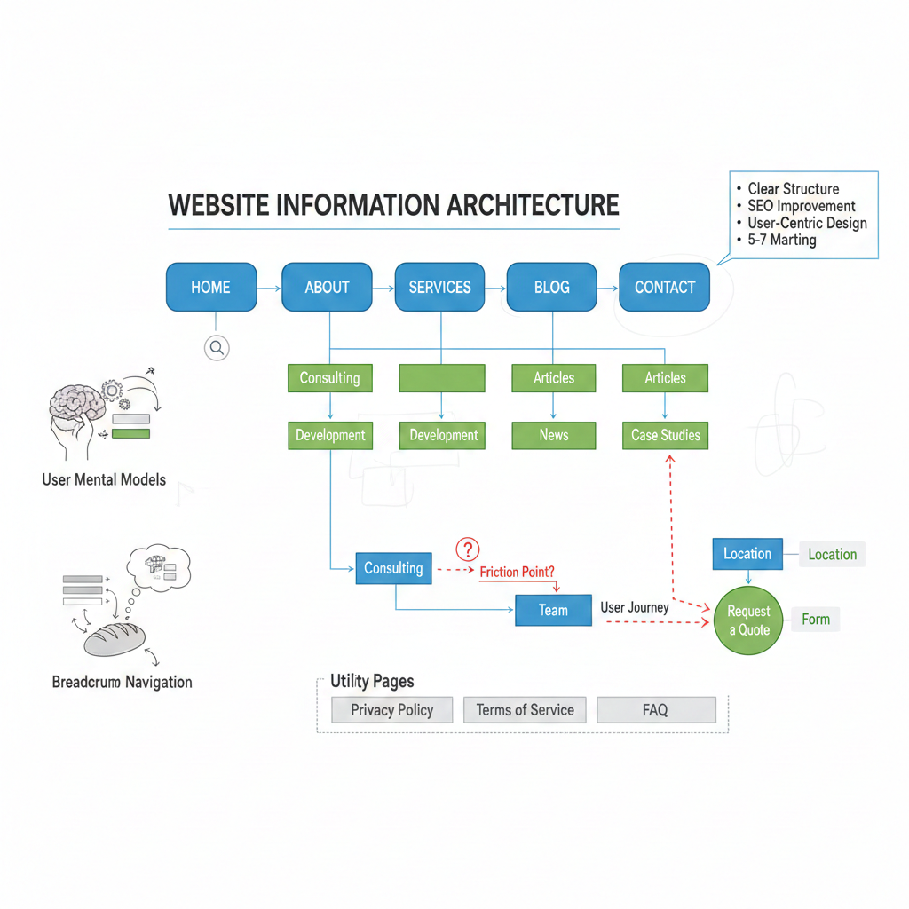
Keep your navigation simple. Studies show users prefer sites with five to seven main menu items. More options create decision paralysis. Group related content under logical categories that match how users think about your offerings.
Consider user journeys through your site. Map the path from the landing page to the conversion goal. Identify potential friction points where users might get confused or leave. Each page should have a clear purpose and guide users toward the next logical step.
Card sorting exercises help determine optimal information structure. Have real users organize your content into categories that make sense to them. This reveals their mental models and prevents you from organizing content based solely on internal company structure.
Website design best practices emphasize clear hierarchies. Primary navigation handles main sections. Secondary navigation or footer links cover utility pages like privacy policies and FAQs. Breadcrumb navigation helps users understand their location within the site structure.
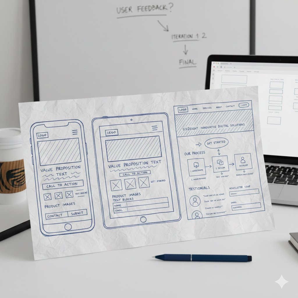
Step 3: Create Wireframes for Layout Structure
Wireframes are simple visual blueprints that show page layouts without distracting design elements. They focus purely on structure, content placement, and functionality.
Start with low-fidelity wireframes using pen and paper or basic shapes in design software. These quick sketches let you test multiple layout concepts rapidly. Include placeholders for:
- Logos
- Navigation menus
- Images
- Text blocks
- Forms
- And call-to-action buttons
Focus on visual hierarchy in your wireframes. The most important elements should be the largest or positioned prominently. Use size, spacing, and placement to guide user attention. Your homepage hero section should immediately communicate your value proposition.
Design mobile wireframes alongside desktop versions. With mobile devices accounting for over 60% of web traffic in 2026, starting with mobile-first wireframes often produces cleaner, more focused designs. Expand these layouts for tablet and desktop screens rather than trying to compress desktop designs into mobile formats.
Popular wireframe tools include Figma, Sketch, and Balsamiq. Figma offers excellent collaboration features and works across all operating systems. These tools let you create clickable wireframes that simulate basic navigation flows.
Test your wireframes with real users before adding visual polish. Watch them attempt common tasks.
- Do they understand where to click?
- Can they find key information easily?
Feedback at this stage costs nothing to implement compared to changes after full design and development. Professional agencies create multiple wireframe iterations based on user testing feedback.
This ensures the foundation is solid before investing in high-fidelity mockups. six2eight uses collaborative wireframing sessions with clients to validate structure early, saving time and budget later in the process.
Step 4: Design High-Fidelity Mockups
Transform approved wireframes into polished visual mockups that showcase your final design aesthetic. This phase brings your brand to life through color, typography, imagery, and detailed styling.
Start by establishing a cohesive color palette. Choose a primary brand color, complementary accent colors, and neutral backgrounds. Colors evoke emotions and reinforce brand identity.
Use contrast ratios of at least 4.5:1 between text and backgrounds to meet WCAG 2.2 Level AA accessibility standards, which become legally required for many organizations by April 2026.
Typography significantly impacts readability and brand perception. Select two to three font families maximum.
Use one font for headings and another for body text. Ensure text sizes meet minimum accessibility requirements: 16 pixels or larger for body copy. Line spacing should be 1.5 times the font size for comfortable reading.
Source high-quality images that reflect your brand authentically. Avoid generic stock photos when possible. Custom photography, illustrations, or professionally shot product images build trust and differentiate your site. Optimize all images by compressing file sizes and using modern formats like WebP or AVIF to maintain fast loading speeds.
Apply consistent spacing and alignment across all elements. Modern designs use 8-pixel grid systems for uniform spacing. This creates visual rhythm and makes designs feel polished and professional.
Design for emotional impact on key pages. Landing pages and homepages should create immediate visual interest through bold typography, striking imagery, or subtle animations. Use white space strategically to give content room to breathe and guide attention to important elements.
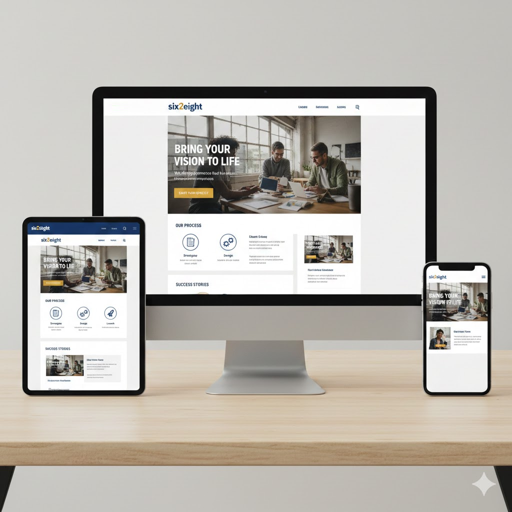
Create mockups for multiple screen sizes. Design desktop, tablet, and mobile versions to ensure responsive layouts work across devices. Tools like Figma include responsive design features that let you preview how elements adapt to different viewports.
Professional designers iterate on mockups based on client feedback and usability principles. They understand color theory, typography best practices, and conversion-focused design patterns.
six2eight creates mockups that balance aesthetic appeal with strategic positioning of conversion elements, ensuring your site looks beautiful while driving business results.
Step 5: Select the Right Website Design Tools and Platform
Choose tools and platforms that match your technical skill level, budget, and project requirements. The right platform affects everything from design flexibility to long-term maintenance costs.
Website builders offer the easiest path for beginners. Platforms like Wix, Squarespace, and Webflow provide drag-and-drop interfaces with pre-designed templates. These tools handle hosting, security, and basic SEO settings automatically. The trade-off is less customization flexibility and potentially higher long-term costs.
WordPress powers over 40% of all websites for good reason. This content management system offers unlimited customization through themes and plugins while remaining accessible to non-developers. Popular page builders like Elementor, Beaver Builder, and Divi provide visual editing without coding knowledge.
For complete design control, code custom websites using HTML, CSS, and JavaScript. This approach requires technical skills but delivers maximum flexibility and optimized performance. Modern frameworks like React, Vue, or Next.js enable advanced interactive features.
Design-focused tools streamline the creative process. Figma leads as the industry standard for UI/UX design, offering powerful collaboration features and a vast ecosystem of plugins. Adobe XD integrates seamlessly with other Adobe products. Sketch remains popular among Mac users. These tools create mockups and prototypes before any actual website building begins.
Converting Figma designs to WordPress has become streamlined with plugins like UiChemy and DataPocket. These tools bridge design and development workflows, though manual implementation by skilled developers typically produces cleaner, faster code.
Consider hosting requirements based on your platform choice. Managed WordPress hosts like WP Engine or Kinsta handle server optimization and security. Static site generators deployed to services like Netlify or Vercel offer exceptional performance for content-focused sites.
Professional web design agencies maintain expertise across multiple platforms. They recommend solutions based on your specific needs rather than one-size-fits-all approaches. Six2eight evaluates your technical capabilities, growth plans, and budget to recommend the optimal tech stack for your business website design.
Step 6: Build Responsive Layouts for All Devices
Responsive website design ensures your site functions beautifully across smartphones, tablets, and desktop computers. This is non-negotiable in 2026 when users expect seamless experiences regardless of device.
Start with mobile-first development. Design and code for small screens first, then progressively enhance for larger viewports. This approach forces you to prioritize essential content and functionality. Mobile designs typically stack elements vertically, use full-width components, and rely on clear tap targets for touch interaction.
Use flexible grids and responsive units. Modern CSS frameworks like CSS Grid and Flexbox make responsive layouts straightforward. Avoid fixed pixel widths for containers. Instead, use percentages, viewport units, or CSS functions like clamp() that adapt to screen size.
Set breakpoints at logical device widths. Common breakpoints include 480px for mobile phones, 768px for tablets, 1024px for small laptops, and 1440px for desktop screens. Test your design at each breakpoint to ensure smooth transitions between layouts.
Implement responsive images using the picture element or srcset attribute. These techniques serve appropriately sized images based on screen resolution and viewport width. A mobile user should never download a massive desktop image. Modern formats like AVIF reduce file sizes by up to 50% compared to JPEG while maintaining quality.
Typography should scale responsively too. Use clamp() in CSS to set minimum, preferred, and maximum font sizes that adjust fluidly. Headlines that look perfect on desktop often overwhelm mobile screens. Body text should remain readable without zooming on small devices.
Test extensively across real devices. Emulators in browser developer tools provide starting points, but nothing replaces testing on actual iPhones, Android devices, and tablets. Check that navigation menus collapse appropriately, forms remain usable, and images display correctly at all sizes.
Touch-friendly interactions are critical for mobile. Buttons and links need minimum touch targets of 44×44 pixels. Space interactive elements adequately to prevent accidental taps. Consider thumb reach zones when positioning important controls on mobile screens.
Responsive design is foundational, not optional. Google uses mobile-first indexing, meaning it primarily evaluates your mobile site for search rankings. Users abandon sites that fail to work on their devices. Professional developers implement responsive patterns correctly from the start.
Step 7: Implement Accessibility Standards
Website accessibility ensures all users, including those with disabilities, can access and use your site effectively. Legal requirements make this essential, with WCAG 2.1 Level AA compliance mandatory for many organizations by April 2026.
Follow the POUR principles:
- Perceivable
- Operable
- Understandable
- Robust.
These four pillars guide all accessibility decisions.
Ensure content is perceivable by all users. Provide text alternatives for images using descriptive alt text. Include captions and transcripts for audio and video content. Use sufficient color contrast between text and backgrounds. Never rely on color alone to convey information. Users with color blindness need additional cues like icons or text labels.
Make your site operable via keyboard navigation. Every interactive element must be accessible without a mouse. Users should be able to tab through links, buttons, and form fields in logical order. Provide visible focus indicators showing which element is currently selected. Avoid auto-playing videos or animations that can trigger seizures.
Create understandable interfaces through clear language and consistent navigation. Write in plain terms avoiding jargon. Keep navigation menus consistent across pages. Provide helpful error messages on forms that explain exactly what needs correction. Break complex processes into clear steps.
Build robust sites that work with assistive technologies. Use semantic HTML elements like header, nav, main, and footer rather than generic divs. Screen readers rely on proper HTML structure to help blind users navigate. Implement ARIA labels where semantic HTML falls short, particularly for dynamic content and custom widgets.
Test with accessibility tools during development. Browser extensions like axe DevTools and WAVE identify common issues. However, automated tools catch only about 30-40% of accessibility problems. Manual testing with keyboard navigation and screen readers remains essential.
Consider accessibility from the start rather than retrofitting later. Accessible design benefits everyone, not just users with disabilities. Captions help people watching videos in noisy environments. Clear navigation assists users in stressful situations. Good contrast improves readability for older adults.
Accessibility violations carry legal risks. The Department of Justice now requires state and local government sites to meet WCAG 2.1 Level AA by April 2026. Many private organizations face similar requirements or lawsuits under the Americans with Disabilities Act.

Step 8: Optimize Website Performance and Core Web Vitals
Website speed directly impacts user experience, search rankings, and conversion rates. Google’s Core Web Vitals measure real-world performance through three key metrics users care about most.
Largest Contentful Paint (LCP) measures loading performance. Your largest visible content element should render within 2.5 seconds. Optimize LCP by compressing images, implementing lazy loading for below-fold content, using a content delivery network (CDN), and minimizing render-blocking JavaScript and CSS.
Interaction to Next Paint (INP) replaced First Input Delay in 2026 as the responsiveness metric. INP should remain under 200 milliseconds for good user experience. Improve INP by reducing JavaScript execution time, breaking up long tasks, and optimizing event handlers. Heavy scripts that block the main thread create sluggish, frustrating experiences.
Cumulative Layout Shift (CLS) tracks visual stability. Your CLS score should stay below 0.1 to prevent annoying content jumps as pages load. Reserve space for images and ads by specifying dimensions in HTML. Load web fonts carefully to avoid invisible or shifting text. Avoid inserting content above existing content unless responding to user interaction.
Implement performance best practices consistently. Enable browser caching so returning visitors load pages faster. Minify CSS and JavaScript files by removing unnecessary characters. Use modern image formats like WebP and AVIF that deliver smaller file sizes. Defer non-critical JavaScript to load after initial page render.
Choose fast hosting infrastructure. Shared hosting often delivers poor performance under traffic. Managed hosting providers or cloud platforms like AWS, Google Cloud, and Cloudflare offer better speed and scalability. Consider static site generation for content-heavy sites to achieve exceptional performance.
Monitor performance continuously using real user monitoring (RUM). Tools like Google Search Console’s Core Web Vitals report show how actual visitors experience your site. Lighthouse audits in Chrome DevTools provide detailed performance recommendations during development.
Performance directly correlates with business outcomes. Research shows 53% of mobile users abandon sites taking longer than three seconds to load. Every 100-millisecond delay in load time can decrease conversions by 7%. Faster sites rank higher in search results, creating a compounding advantage.
Achieving optimal Core Web Vitals requires technical expertise. Professional developers implement advanced optimization techniques like code splitting, tree shaking, and efficient resource loading strategies.
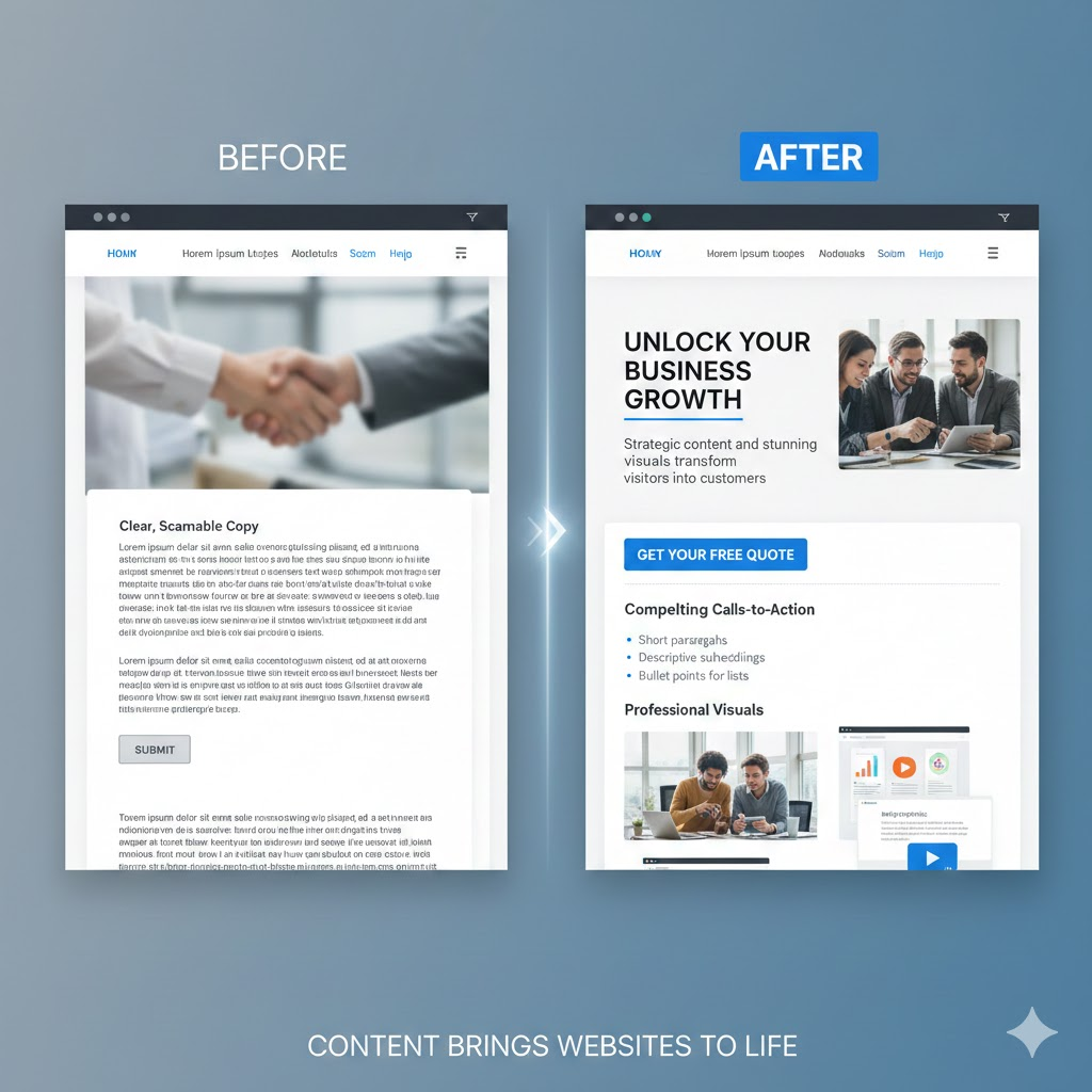
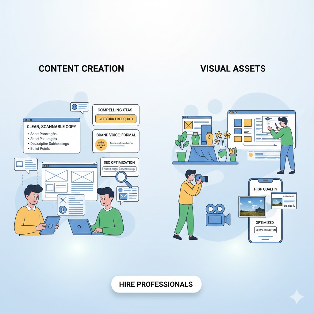
Step 9: Create Compelling Content and Visual Assets
Content brings your website design to life. Strategic, well-crafted content engages visitors, communicates value, and drives conversions.
- Write clear, scannable copy.
- Web users skim rather than reading word-for-word.
- Use short paragraphs of 2-3 sentences maximum.
- Break up text with descriptive subheadings that help readers find information quickly.
- Use bullet points for lists rather than lengthy paragraphs.
Lead with value in headlines and opening sentences. Users decide whether to keep reading within seconds. Answer the question “what’s in it for me” immediately. Avoid industry jargon or clever wordplay that obscures meaning. Clarity always beats creativity in web copy.
Craft compelling calls-to-action (CTAs). Every page should guide users toward a specific next step. Use action-oriented button text like “Get Your Free Quote” instead of generic “Submit” labels. Place primary CTAs above the fold and repeat them strategically throughout longer pages.
Develop a consistent brand voice. Your tone should align with your audience and industry. A law firm maintains formal, authoritative language. A creative agency can be playful and energetic. Consistency across all content builds trust and recognition.
Optimize content for search engines without sacrificing readability. Include target keywords naturally in headlines, subheadings, and body text. Write for humans first, search engines second. Google’s algorithms increasingly prioritize content that genuinely helps users over keyword-stuffed pages.
Source or create professional visual assets. Custom photography differentiates your brand from competitors using stock images. Illustrations can explain complex concepts more effectively than text alone. Icons improve scannability and add visual interest. Videos engage users and often increase time on page.
Ensure all visual content has purpose. Every image should support your message or enhance understanding. Decorative images should enhance rather than distract. Large, high-quality visuals make sites feel premium and trustworthy.
Compress images without visible quality loss. Tools like TinyPNG, ImageOptim, or automated services like Cloudflare Images reduce file sizes by 50-80%. Properly optimized images maintain visual quality while significantly improving load speeds.
Consider hiring professional copywriters and photographers. Quality content requires skill and time. Professional writers craft persuasive copy that converts. Professional photographers create distinctive visuals that elevate your brand. These investments typically deliver strong returns through improved engagement and conversion rates.
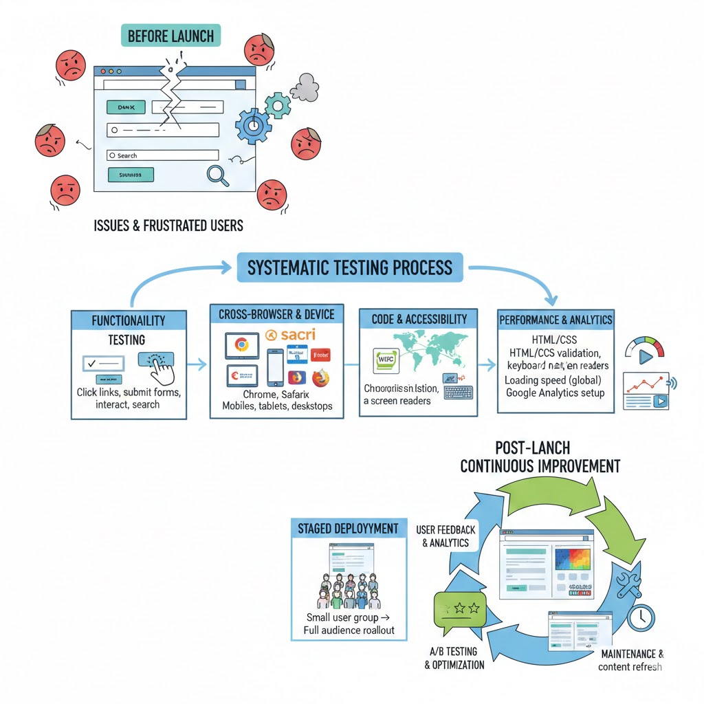
Step 10: Test, Launch, and Iterate
Testing before launch catches issues that frustrate users and damage credibility. A systematic testing process ensures your website works correctly across all scenarios. Conduct thorough functionality testing. Click every link to verify it leads to the correct destination.
Submit every form to confirm data processes properly. Test all interactive elements like dropdown menus, sliders, and modal windows. Verify search functionality returns relevant results.
Perform cross-browser testing. Your site should work identically in Chrome, Safari, Firefox, and Edge. Different browsers render CSS and JavaScript slightly differently. Use tools like BrowserStack or real devices to test comprehensively. Don’t assume your site works everywhere based on testing in one browser.
Execute cross-device testing on actual hardware. Test on multiple smartphones, tablets, and desktop computers. Pay special attention to older devices that may struggle with heavy animations or scripts. Your site should remain usable even on less powerful hardware.
Validate your code using W3C validators. Clean, semantic HTML and valid CSS prevent unexpected rendering issues and improve accessibility. Fix validation errors before launch.
Run accessibility audits using automated tools like WAVE or axe DevTools. Then conduct manual testing with keyboard navigation and screen readers. Ensure all functionality remains accessible without a mouse.
Test loading speed from different geographic locations. Use tools like GTmetrix or WebPageTest to analyze performance from various servers worldwide. Identify bottlenecks affecting international visitors.
Review analytics implementation before launch. Verify Google Analytics or your chosen platform tracks page views, events, and conversions correctly. Set up goal tracking for key user actions. Proper analytics let you measure success and identify improvement opportunities.
Implement staged deployment when possible. Launch to a small percentage of users first. Monitor for issues before rolling out to your full audience. This approach minimizes impact if problems arise.
Plan for continuous improvement post-launch. Websites are never truly finished. Gather user feedback through surveys, session recordings, and heat maps. Monitor analytics to identify pages with high bounce rates or low conversion rates. A/B test design changes to validate improvements before full implementation.
Maintenance keeps sites secure and performant. Update plugins and themes regularly. Monitor uptime to catch server issues quickly. Refresh content periodically to stay relevant and maintain search rankings.
Essential Website Design Best Practices for 2026
Modern website design for conversions follows proven principles that improve user experience and business outcomes.
Prioritize Page Speed
Every additional second of load time decreases conversions by approximately 7%. Optimize images, minimize code, enable caching, and use a CDN. Fast sites rank higher and convert better.
Design for Mobile First
Over 60% of web traffic comes from mobile devices. Start your website design process with mobile layouts, then enhance for larger screens. This ensures your site works brilliantly on the devices most people actually use.
Maintain Consistent Navigation
Place main navigation in expected locations top of page or left sidebar. Use identical navigation across all pages. Consistency reduces cognitive load and helps users find information faster.
Use Visual Hierarchy Effectively
Size, color, contrast, and spacing guide attention to important elements. Make headlines larger than body text. Use color to highlight calls-to-action. Create clear focal points on every page.
Implement White Space Strategically
Empty space is not wasted space. Adequate margins and padding prevent cluttered designs. White space improves comprehension and gives content room to breathe.
Design Clear Call-to-Action Buttons
CTAs should stand out through contrasting colors and prominent placement. Use specific, action-oriented text. Make buttons obviously clickable with sufficient size for easy tapping.
Build Trust Through Professional Design
Quality visuals, error-free copy, and polished interactions signal credibility. Poor design makes visitors question your professionalism and reliability. First impressions form within 50 milliseconds.
Plan for Scalability
Design systems and components that accommodate future growth. Choose platforms and tools that scale as your business expands. Avoid designs that lock you into rigid structures.
Frequently Asked Questions
How long does it take to design a website from scratch?
A basic website design typically requires four to eight weeks from planning to launch. This timeline includes research, wireframing, visual design, content creation, and testing phases. More complex sites with custom functionality may take 12 to 16 weeks or longer. E-commerce sites with extensive product catalogs require additional time for category structure and payment integration. Timeline depends heavily on content availability and decision-making speed.
Do I need coding knowledge to design a website?
You can design functional websites without coding knowledge in 2026. Website builders like Wix, Squarespace, and WordPress with visual editors allow complete site creation through drag-and-drop interfaces. These platforms handle technical implementation automatically. However, basic HTML and CSS understanding provides advantages. You gain better control over customization and can troubleshoot minor issues independently. Visual design skills matter more than coding ability for many site types. Focus on understanding user experience principles, visual hierarchy, and content organization.
How much does professional website design cost?
Website design costs vary widely based on complexity and designer experience. Freelance designers charge between $500 and $5,000 for small business sites. Mid-sized sites with custom functionality range from $5,000 to $25,000. Large corporate sites or complex e-commerce platforms can cost $25,000 to $100,000 or more. Agency rates typically exceed freelancer rates. Template-based sites cost less but offer limited customization. DIY using website builders costs $10 to $50 monthly plus annual domain fees. Consider ongoing maintenance costs in budgeting. Cheaper initial builds sometimes require expensive fixes later.
How can I ensure my website is accessible to people with disabilities?
Start by following WCAG 2.1 Level AA guidelines at minimum. Use semantic HTML to communicate page structure to assistive technologies. Provide text alternatives for all non-text content including images and videos. Ensure sufficient color contrast between text and backgrounds. Make all functionality available via keyboard without requiring a mouse. Include visible focus indicators showing which element is active. Test your site with screen readers like NVDA or VoiceOver.
Automated tools catch some issues but miss many others. Include people with disabilities in your testing process for real-world validation. Provide captions for videos and transcripts for audio content. Avoid using color alone to convey information. Consider cognitive accessibility by using clear language and predictable navigation. Accessibility benefits all users and is increasingly required by law in many jurisdictions.
What website builder is best for beginners in 2026?
Wix provides the most beginner-friendly experience in 2026. Its drag-and-drop interface requires no technical knowledge. AI-assisted design helps create professional-looking sites quickly. Extensive template library covers most business types. Built-in hosting eliminates separate hosting setup. Squarespace offers another excellent beginner option with focus on visual appeal. Templates are consistently high quality with less customization flexibility.
WordPress with visual builders like Elementor balances ease of use with future flexibility. It requires slightly more learning but provides greater long-term control. Shopify serves as the best beginner choice specifically for e-commerce. All these platforms offer free trials allowing hands-on evaluation before commitment. Choose based on your specific needs and content type rather than universal recommendations.
How often should I update my website design?
Minor updates should happen continuously based on analytics and user feedback. Fix usability issues as they surface. Update content regularly to maintain relevance. Major design refreshes typically occur every two to three years. This frequency keeps sites current without constant disruption. However, timing depends on business changes and industry evolution. Rapidly changing industries may need more frequent updates.
Established businesses can maintain designs longer. Monitor competitor websites and design trends. Redesign when your site appears noticeably dated compared to industry standards. Functional sites performing well may not need redesign on schedule. Prioritize improvements that solve real user problems over aesthetic refreshes. Incremental changes often prove more effective than complete overhauls. Test changes before site-wide implementation when possible.
Conclusion
Modern website design in 2026 balances aesthetics with functionality. Fast loading speeds, mobile responsiveness, and accessibility are not optional features but fundamental requirements. Users expect seamless experiences across all devices. Search engines reward sites that meet these standards.
Start by planning thoroughly before opening design tools. Understand your audience and define clear goals. Create wireframes to solve structural problems efficiently. Implement designs using responsive techniques and accessibility best practices. Test with real users and iterate based on feedback. Launch confidently knowing you followed proven processes.
Website design is an ongoing commitment rather than a one-time project. Monitor performance, gather user feedback, and implement continuous improvements. Stay informed about evolving standards and technologies. Your investment in learning these principles will serve you throughout your digital journey.